Prefect
Intro
I was the lead designer for Prefect Cloud, a product used to help data engineers and data platform operators manage their orchestrated workflows. Workflows are collections of Python functions that are run on cloud infrastructure, typically in an automated way, whether scheduled or trigged from events (e.g. webhooks).
Team and collaboration
I reported to the VP of Product, and collaborated most closely with our CEO, lead front-end developer, and technical product manager.

This is how we collaborated on projects:
- The CEO or VP of Product would come to me with a problem to be solved, and I would hold an initial requirements gathering meeting where we would hash out the problem and create an epic in Linear.
- I then built out low-fidelity exploratory prototypes in Figma, sharing explorations daily in Slack, until we converged on a design that felt right and that satisfied the original requirements.
- Because of the speed of front-end engineering, our approach to gathering user feedback was to implement the Figma prototypes in code, and release them to production behind a feature flag.
- As we got feedback from early adopters (or internal stakeholders—such as technical PMs and sales engineering), we'd iterate on the implementation until it met our quality bar and then we'd release it.
Projects generally took 1-2 months to complete, depending on resource availability.
Runs page redesign problem
One of the problems I tackled was a redesign of the main Runs page. The runs page is used to monitor the behavior of all workflows over time. We wanted to provide a more powerful timeline view of runs (inspired by Pydantic Logfire) and to add some additional top-level metrics (SLA Violations).
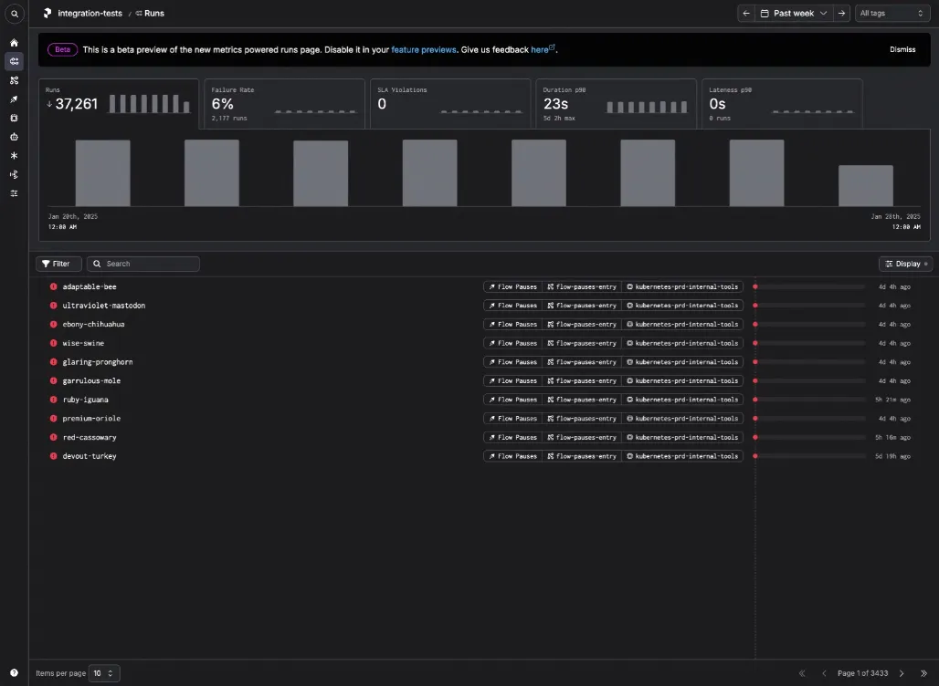
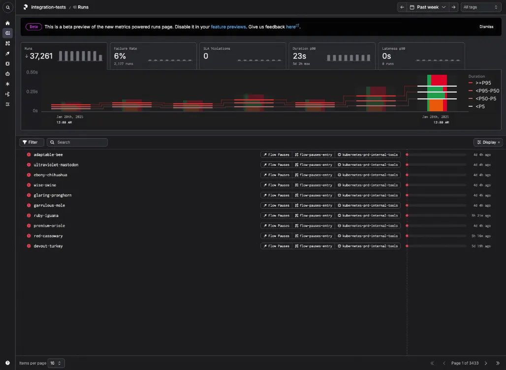
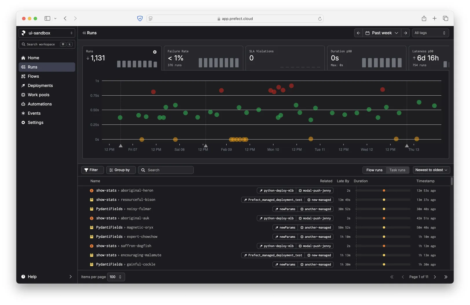
However, we had gotten all the way to a soft launch of the new experience when we starting getting feedback from customers that made us aware of a significant problem with the bar chart on the Runs tab. The bar chart in question shows the count of runs for each day in the selected time span (one week by default).
People said they missed the original data visualization on this page, which we had dubbed "The Ball Pit". My job was to figure out why they missed it and what to do about it.
The Ball Pit
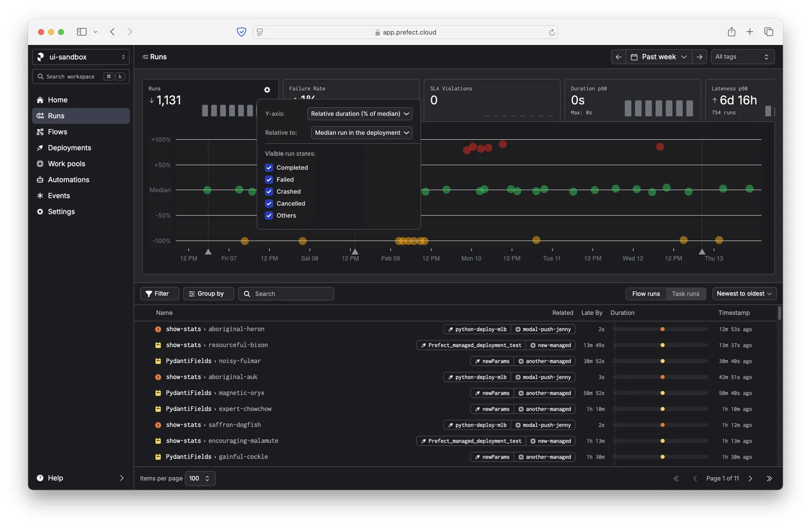
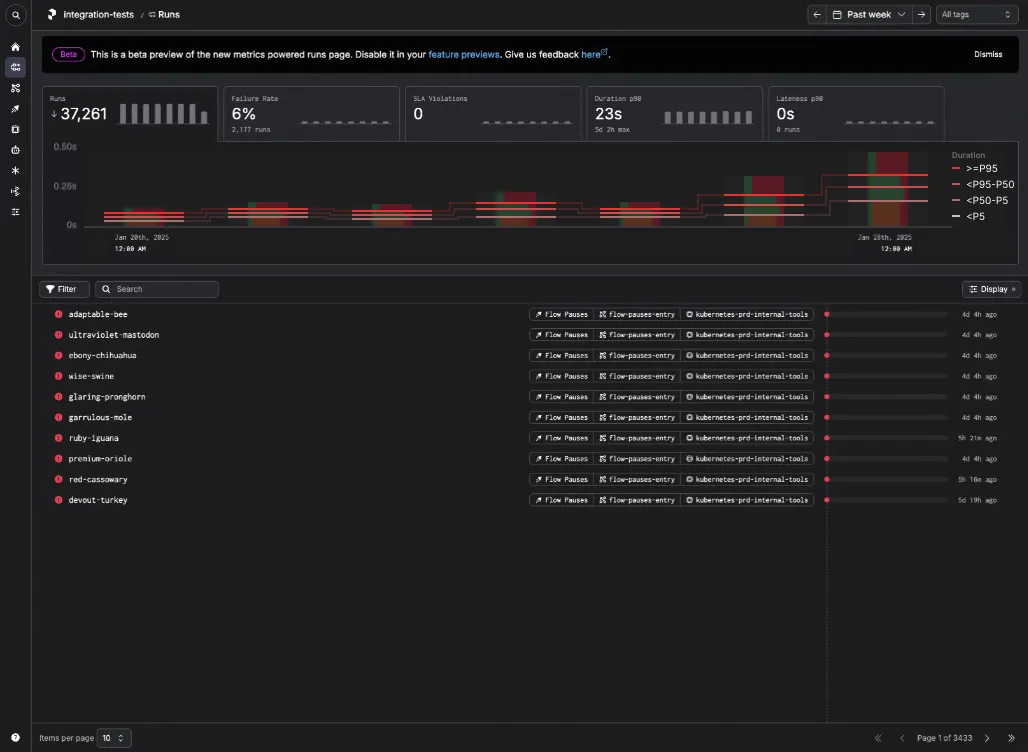
I've overlaid the Ball Pit on top of the bar chart to give you an idea of what it looked like.
The Ball Pit is a scatterplot, where each dot represents an individual run. The color of the dot represents the status of the run (for example, pending, running, completed, failed). The y-axis represents the duration of the run. The x-axis represents the time when the run started.
The Ball Pit has a significant problem. When there are more than 200 runs, the API truncates the response and only returns the 200 most recent runs. This is why the plot looks oddly broken much of the time. Most of Prefect's enterprise customers have tens of thousands of runs per week, so they're only seeing a small fraction of their runs.
This was the original motivation behind replacing the Ball Pit with a simpler bar chart. We couldn't show all of the individual runs, but we _could_ show a statistical aggregation of all runs (the count of runs). However, after getting feedback that people missed the ball chart, we tried to see if we could bring back more of the granularity from the Ball Pit.
Statistical aggregation exploration
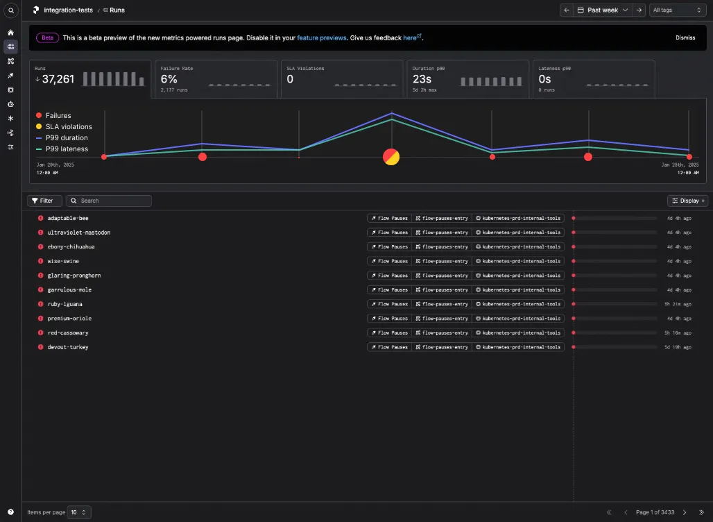
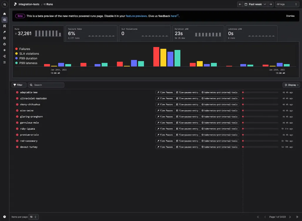
My first idea was to do statistical aggregation by showing p-value thresholds instead of a total count. I did a few iterations to explore this idea:
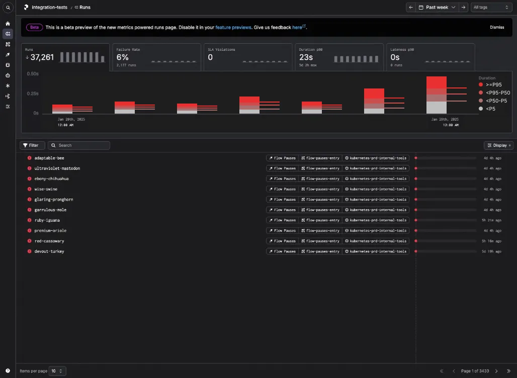
- A clustered bar chart, where each color represents a specific threshold:
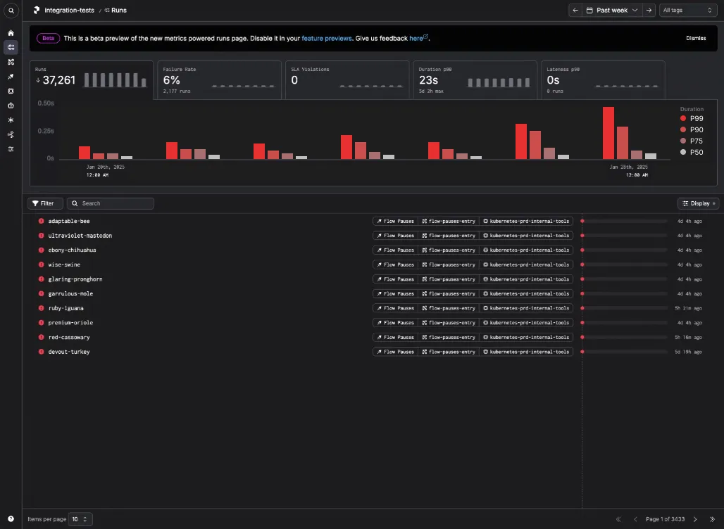
- A modified box and whiskers plot, which shows both the thresholds and the delta between thresholds:
- A stacked bar chart, which shows the same information but in a less visually noisy way:
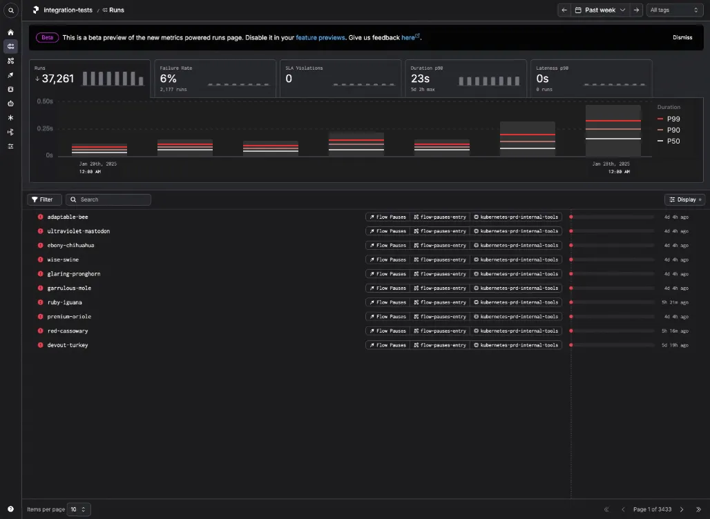
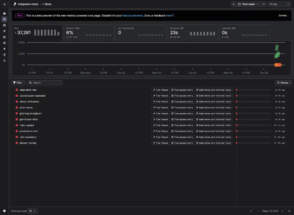
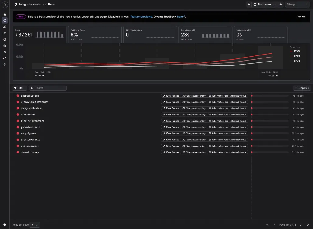
- A traditional line chart overlaid on top of daily run counts, which is closer to the industry standard for this type of visualization:
- A nested stacked bar chart, where the vertical bars represents the daily run counts and thresholds.
 And when you hover, we highlight the horizontal bars which represent the proportion of run states within each theshold band.
In the end, we decided to use the traditional line chart for each of the high level tabs, with the exception of the Runs tab. The Runs tab is what needed to solve the Ball Pit problem, and unfortunately these approaches didn't quite get us there.
Multi-dimension exploration
While those initial explorations avoided the 200 run limit of the original ball chart, users told us they still missed the glanceability of the Ball Pit. Users don't want to have to choose a metric (Run Count, Failure Rate, SLA Violations, Duration, Lateness) in order to see if that metric has anomalies. What users want is to have a single pane of glass they can look at to passively see if there are anomalies in any dimensions, after which they can drill down futher.
While the Ball Pit had significant shortcomings, it solved the single pane of glass problem very well. I tried a couple of explorations to see if I could represent all of these dimensions in a single plot.
- Show P99 thresholds where that makes sense (Duration, Lateness), and show other metrics sized according to their absolute counts (Failure, SLA Violations).
- Show all metrics as a clustered bar chart, which is simpler and less clever.
However, these visualizations didn't resonate with internal stakeholders or our users, so I went back to the drawing board and approached the problem from a first principles approach.
Observability first principles
Those explorations came further to being replacements for the Ball Pit, but we didn't have enough confidence in them. Rather than shipping a mediocre experience, I revisited the core observability problems that users have, including problems that even the Ball Pit _doesn't_ solve.
- Most run failures are caused by changes to code, infrastructure, or run duration.
- Users want to see anomalies in run duration, but they want to see the deviation fom the median run for each run's parent deployment or work pool, not the mean for all runs as a whole.
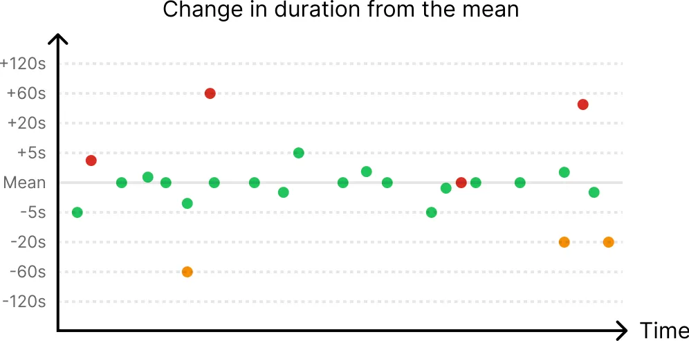
- If a run fails, users want to be able to see if this is a recurring pattern for other runs in the same workflow.
Interestingly, these problems are better solved by a scatterplot versus the statistical aggregations from the previous explorations. Users need to be able to see failure at the granularity of individual runs, which statistical aggregations can't do well.
Ball Pit redux
Given all of these explorations, we realized we probably wanted to enhance the Ball Pit rather than replacing it with an entirely new visualization. However, we couldn't do this with a hard limit of 200 runs. Given that, I went back to engineering to ask if this was a law of physics or something we could find a creative solution for (progressive loading, optimizing the payload from the API, etc).
It turned out that we could create a new API endpoint specific to the Ball Pit which would let us load up to 10,000 runs at a time. While not perfect, we decided this was good enough for most users, since:
- Users can restrict the timespan to limit the number of runs that are shown.
- We can introduce additional filters to hide runs that are less interesting (for example, successful runs, which are the majority of all runs).
With that limitation resolved, I went ahead and designed the solution that we ended up building.
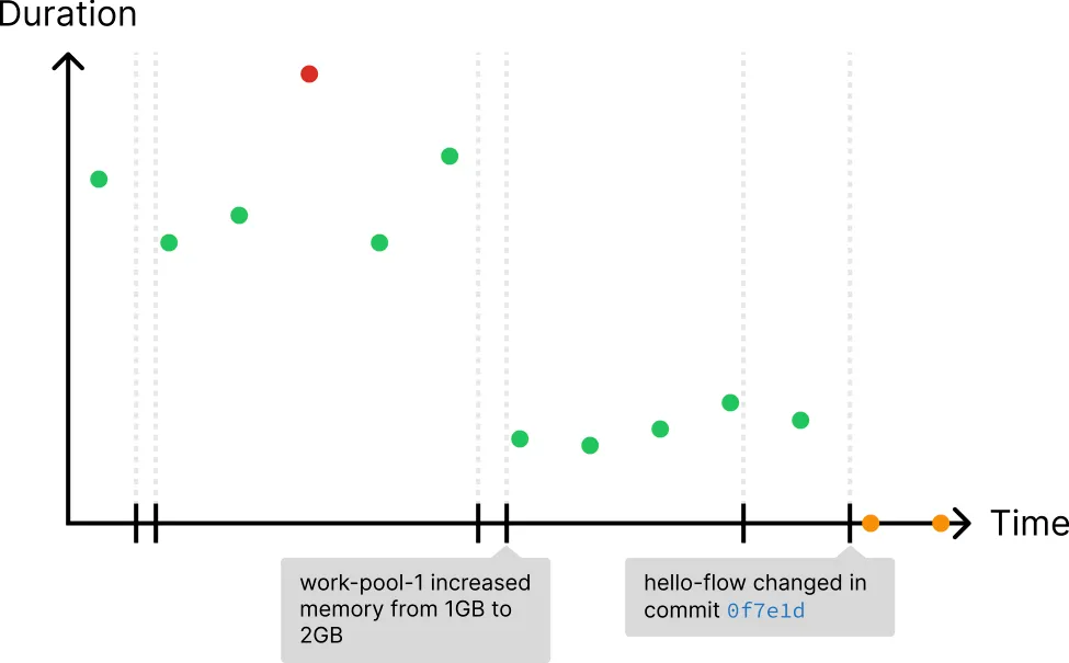
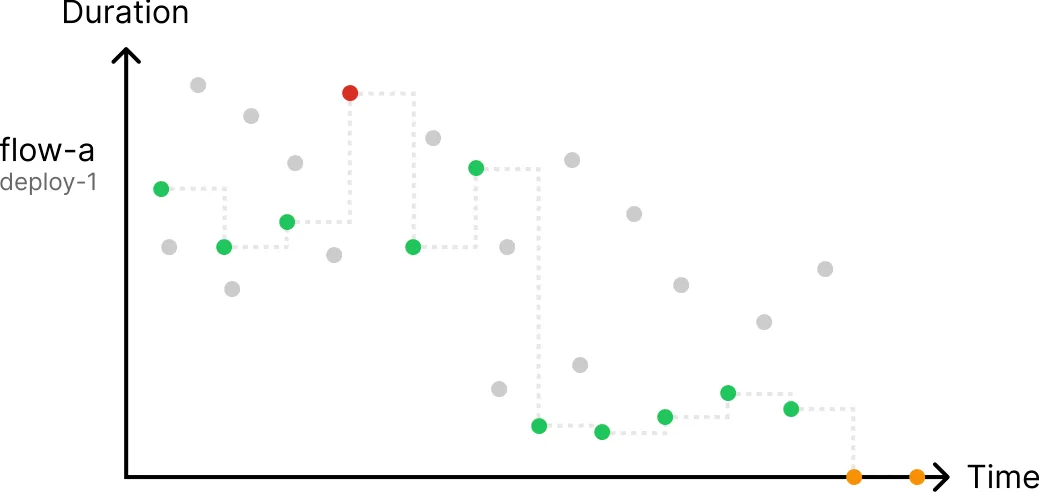
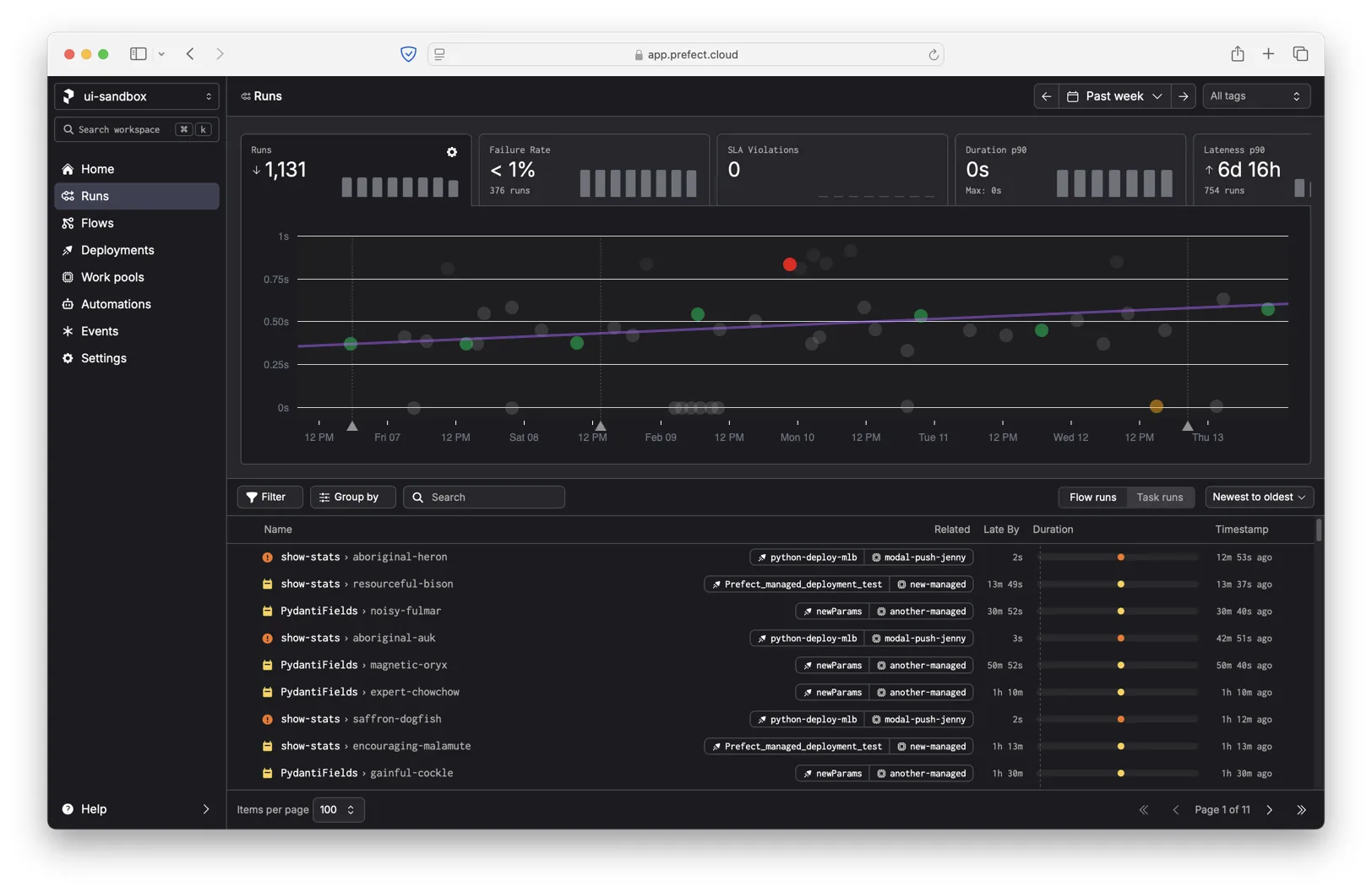
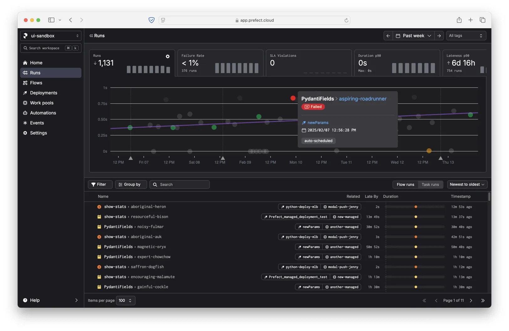
When you hover over an individual run in the chart, we highlight the other runs from the same workflow and show a trend line.
When you click a run, we show a floating dialog with some additional metadata about the run.
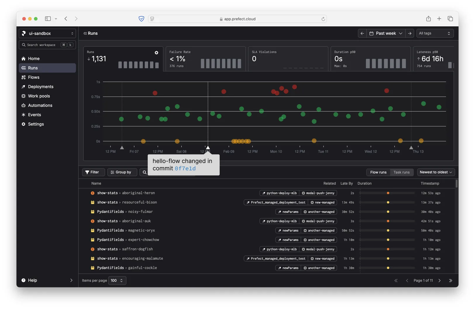
When you hover over an annotation on the x-axis, we show the associated infrastructure or code change.
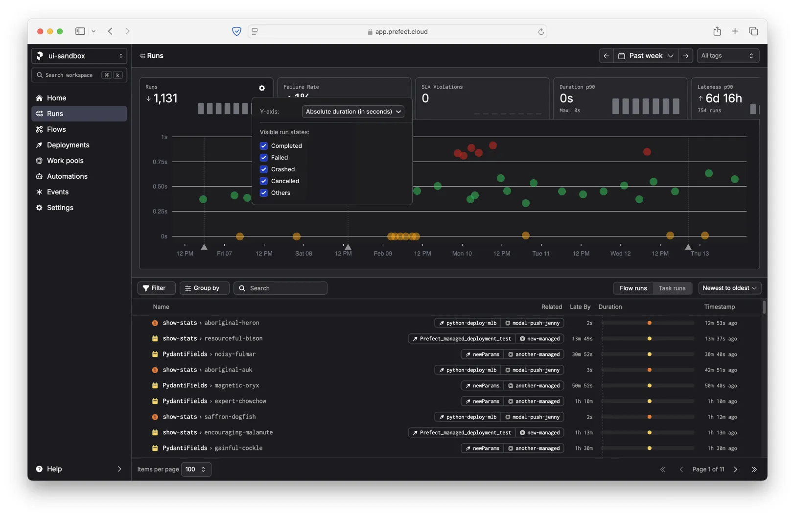
The Runs tab has a settings dialog that lets you dial in the chart to your preferences. One important function is the ability to hide specific run states (for example, Completed) if there is too much visual noise or if there are too many runs to display at once.
We decided to make the new relative duration y-axis opt-in. Even though users care more about deviation from the median parent workflow, we didn't want to confuse people accustomed to the original y-axis (absolute duration).
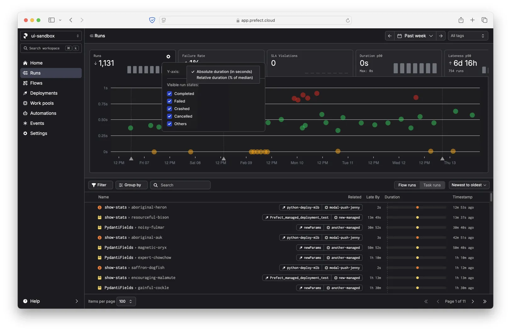
If you do change the y-axis to show the change from median, we show an additional setting that lets you control how the median is calculated. For example, you can show the median deviation from the parent deployment or the parent work pool (the infrastructure on which flows are run).